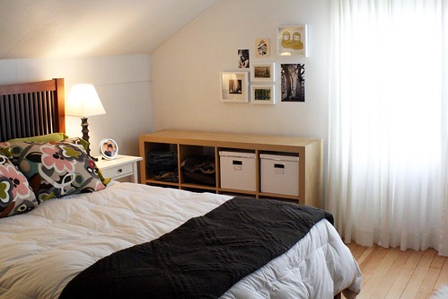
Here's a close up of the picture wall.
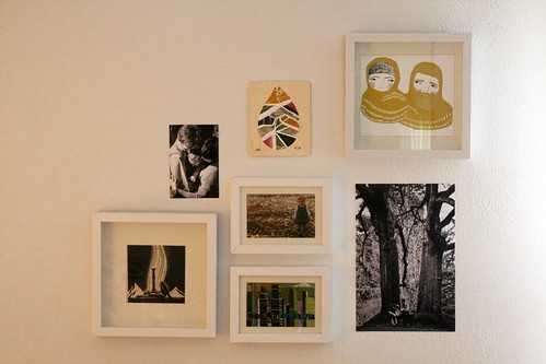
The black and white photos were taken by our friend Sarah Grace last spring. Then there's the awesome Ashley G. print that I gave the Wise and Bearded One for our 15th wedding anniversary. The photo in the middle is a favorite that I shot of the Sprout one day this fall. Underneath is a postcard from another Portland artist (I'm too lazy to go look up his name)--It's a portrait of Portland. The vintage print on the left is one Nate collected a long time ago and has been sitting in a box unframed for lo these many years. And the raindrop (of course, it's Portland, isn't it?!) is a new purchase from the fabulously talented Leah Duncan (not from Portland, but Austin, Texas, which is good enough).
What I like about the room:
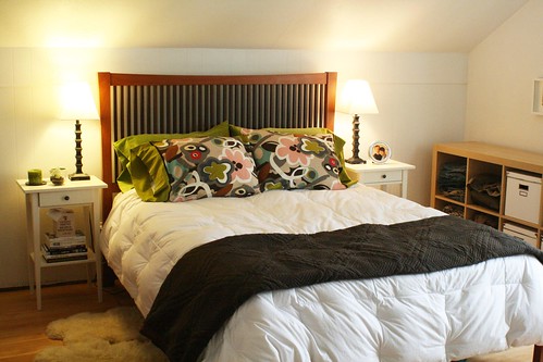
--I definitely like it better painted bright white
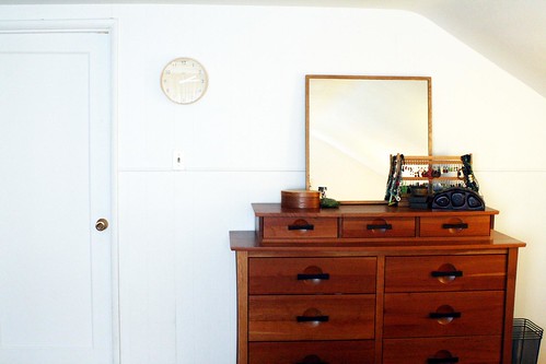
--The wood floors and the wood furniture pop against the white
--The art/photos and the print pillow (also from Leah Duncan's Etsy shop)
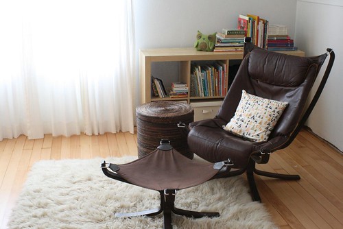
--The Mobler chair finally has room to breath; it always looked cramped in our living room
--The flokati looks it might have found a permanent home too
What I am still looking for:
--Those night stands (el cheapo IKEA models) were always intended to be temporary and eventually go to our (currently-nonexistent) guest room. Must find something more substantial with better storage.
--Lighting. I still might spring for the Robert Abbey scissor-arm sconces that I had on my mood board. But I need to solve the nightstand issue first.
--The perfect print for pillows on the bed and maybe an additional piece of art or two to add that graphic pop that I want.
--I need to repot a plant or two to add some real green to the space. Plus I like that house plants clean the air.
What we want to change in the future:
--Although the IKEA Expedit is a staple in our house, I would really like to not have to use them for clothes storage in here. They visually close in some of the space. I would like to build shelving/cabinets into the knee wall behind the Mobler chair. The closet in here was built for a 1930s wardrobe so clothing storage is an issue.
--The ceiling (not pictured) is really low. Nate and I would like to bust it out this summer, put in new insulation, lighting and ceiling and paint the beams white. That's also why the trim wasn't replaced/repainted--we'll do it "later".
--The crib (not pictured) is taking up a corner of the room, and the Sprout's books are taking up space on the Expedit. She'll be back in her own room as soon as we're done playing musical rooms around the house.
Overall, it's a huge improvement over our previous cramped bedroom. I'd love to hear your thoughts and comments.
What would you add or delete, change or tweak? What do you find essential in your own bedroom to make it a good sleeping space?
8 comments:
I think it's beautiful!
Love the white and the wood and the chair! and the rugs...
I think you hit the nail on the head when you talked about using low dressers for side tables. That would take care of your clothing storage problem while keeping them concealed...even paint them a color to add a little something. Then you could get rid of the expedit, maybe even continue the gallery wall to the floor to add a graphic punch. And I love the idea of building shelves for behind the chair.
I'm dying to tackle our room. I have most of the core pieces in there already, I just haven't painted them yet. Oh, and my temporary (two year) curtains are killing me.
I love that dresser!! Beautiful. I also love the reading nook, and I like Kate's idea of low dressers next to the bed and the gallery wall to the floor. That would certainly add a lot of color and visually clear the space a bit more. It's coming along!
I think it looks delightful - a calm space to relax in - rest your body, mind and soul when the world is whirring around you. Looking forward to 'what's next' ... thanks for sharing!
very nice! love the bright white and the art!
How nice to have everything back in order even though there are a few things you would like to tweak! I, too, like the brightness of the white paint and the extra space. Well done!
Everything looks beautiful! Could you tell me where you got your perfect dresser? I've been searching CL for a long time with no results, and yours is WONDROUS.
We've used tiny dressers as bedside tables with great results as far as storage goes. You have great taste!!
I think it's looking great! I really need to fix up our room. It still has moving boxes (mostly of sewing stuff) in it, actually. I'm so inspired by seeing your room! :) I love the photos you chose.
Blessings,
Michele
Post a Comment